ESSIE | Designing a fashion e-commerce website
Challenge
In this Modern era, people mostly love going digital for everything. People have access to get everything at their doorstep. That has led to the tremendous growth of online shopping. Essie is a fashion clothing brand that has a physical store and is concerned about the business going down since people don't visit their store as much because of the growth of online shopping and its convenience. They want an e-commerce website and also want their brand to be reflected in the website.
Solution
To design a fashion e-commerce website for Essie so that people could view a wide variety of products and purchase the same without any hassle online, thereby increasing their business and also to design the website with the brand reflection with the required styling and colours that goes with the brand.
User Research
To learn about people’s experiences using online shopping sites and to know their pain points I conducted interviews with five people and also did a comparative analysis with a few other websites.
Pros
- People loved using the app since they don't have to go out anywhere to make a purchase
- People also love how online shopping sites have a variety of products displayed.
- It is also found that the return & exchange policy is really a good thing.
- The filter option is really good to save time and get the desired product fast.

Cons
- Sometimes wrong or damaged products are delivered
- The other concern is that it has too many products to display that the users sometimes are indecisive.
- Lack of image in a few products is an inconvenience.

Outcome of Research
- All the products listed must have one image or more.
- Filters on the website are mandatory.
- Products should be categorized properly so that it is easy for the user to decide
Things must have for a Website
- Site ID – The site ID should be the most prominent thing on a website, it should be bold and visible. You don’t want the user to feel puzzled all of a sudden not knowing where he is.
- What is the site? – The site should answer What can I do here? Where am I? and What is this? Users don’t always directly type the link and get in, users may click it from social media or some other websites or get in from a link in a mail or maybe redirected from elsewhere. So it shouldn’t be like the user is lost somewhere. The user should know exactly where he is and what the site can do.
- Search bar – There should be a search bar on all sites because there are a lot of people who have the practice of getting into a website and directly searching for what they want and don’t wait to explore the website. As many research results suggests, it is better to have a search bar at the top right corner of the page for the best use.
- Subsections – It is ideal to have subsections on a website, which tell what is inside the card if a user clicks on it. So it will be easier for the user to know what exactly the card is for and reduces complexity.
- Footer – The Footer should include details like About us, contact us, feedback, Website policy and emergency contacts. It can also include social media links or a link to subscribe to the newsletter if any.
Information Architecture
Below is the Information Architecture of the website.There are two types of people, one group knows what exactly they wanna buy and the other group just explore and buy if he/she finds something interesting. So the information architecture is made keeping that in mind.

Low Fidelity wireframe
I created a few low-fidelity wireframes as per the mindmap. It is just a rough sketch as a first step before creating high fidelity wireframe to get an idea.

High Fidelity wireframe
After getting a basic outlook idea of the app, I started designing high-fidelity wireframes. Hi-Fi wireframes are usually those we create with high details and take more time.

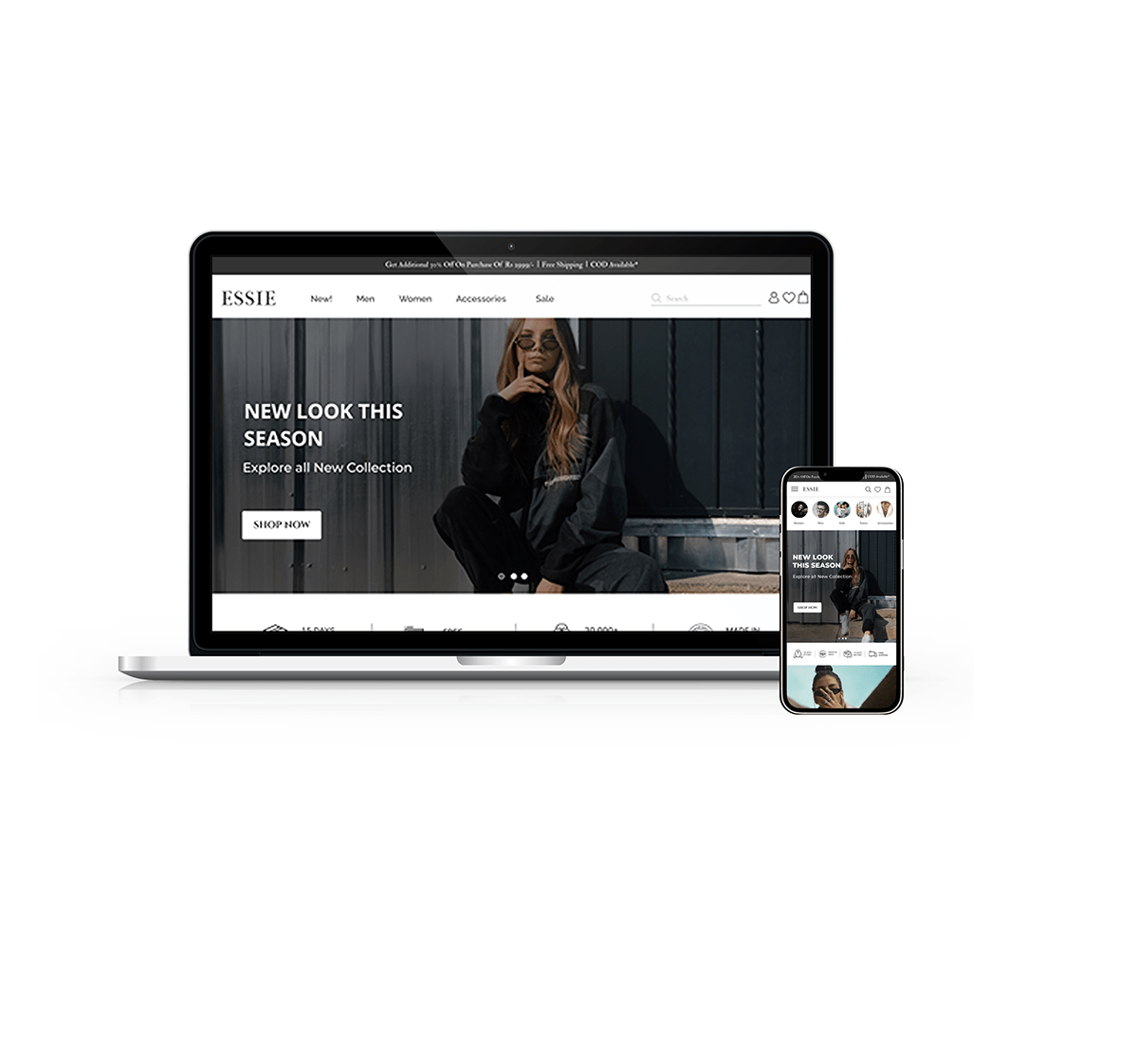
Final Screen
After iterating, I finalized the below-given screen which I felt was pleasing to view.

It was great working on this project. It was fun to experiment with lot of new layouts and finally pulling out the design as per customer's requirement.
Thank you for viewing. Feedbacks are always welcome :)


